Master React File Uploading: Convert Single File Uploads into Multi File Uploads with Progress Bars and Drag-and-Drop Support in Just a Few Steps

This is a continuation of the previous article: How to Upload Large Files Directly to Amazon S3 in React/Next.js
Our "finished" React s3 direct uploader that we built has some limitations. We can only upload 1 file at a time, we don't have any progress indicators, and we would like to support dragging and dropping files into a drop area with some visual indicators. In this article, we will give the front end a little TLC with Tailwind CSS and expand our uploader to be able to handle many uploads at the same time.
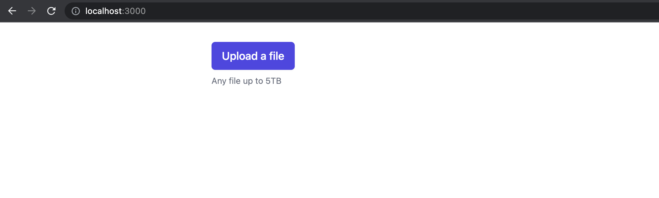
Currently, our application looks like this:
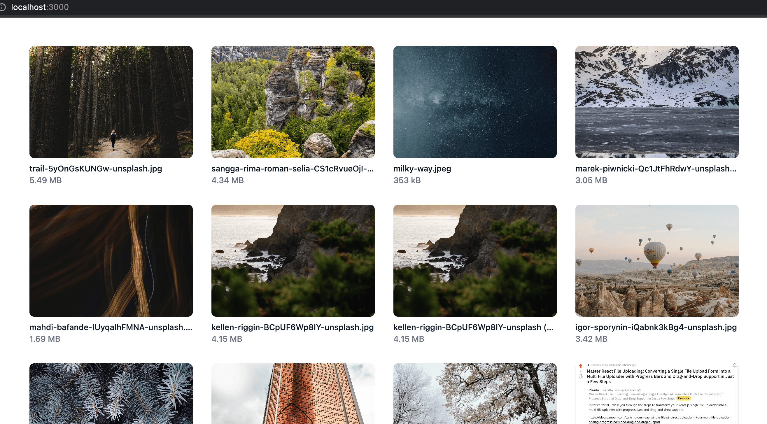
By the end of this article, your application will look like this:

tldr; The full source code for this example is here: https://github.com/danoph/file-uploader-demo/tree/story/progress-and-multi-upload
I think the simplest thing to add first would be to add a little bit of styling as well as a progress bar for the single file uploader form. Let's add a progress bar component to our pages/index.tsx file:
// pages/index.tsx

const UploadProgressBar = ({ progress }) => (
  <div className="py-5">
    <div className="w-full bg-gray-200 rounded-full">
      <div
        className={`${
          progress === 0 ?
            'invisible'
            : ''
        } bg-indigo-600 text-xs font-medium text-blue-100 text-center p-0.5 leading-none rounded-full`}
        style={{ width: progress + "%" }}>
        {progress}%
      </div>
    </div>
  </div>
);
Instead of immediately starting an upload when we choose a file, let's add an explicit button to start the upload and give a little less weight to our current upload button since it will be used to stage the file for upload. We can also add a few more details about the file selected like the file name, type and size. I want to show a human friendly size, so we can introduce a third party library called pretty-bytes that will convert bytes to KB, MB GB, etc:
npm i pretty-bytes
And reference it in our Home component. We will also need to add a useState to keep track of the file upload progress. We also need to modify the uploader.onProgress method so we can update progress as needed. Here is the modified Home component that uses our new UploadProgressBar component, keeps track of the current file upload progress, changes the button styling and adds a new button to be explicit about starting an upload:
// pages/index.tsx

export default function Home() {
  const [inputValue, setInputValue] = useState("");
  const [upload, setUpload] = useState<Uploader | null>(null);
  const [progress, setProgress] = useState(0);

  const onFileChanged = e => {
    const file = [ ...e.target.files ][0];

    const uploader = new Uploader({ file })
    .onProgress(({ percentage }) => {
      setProgress(percentage);
    })
    .onComplete((uploadResponse) => {
      console.log('upload complete', uploadResponse);
    })
    .onError((error) => {
      console.error('upload error', error)
    });

    setUpload(uploader);
  };

  const uploadClicked = () => {
    if (!upload) { return }

    upload.start();
  };

  return (
    <div className="mx-auto max-w-7xl sm:p-6 lg:p-8">
      <div className="flex text-sm text-gray-600">
        <label
          htmlFor="file-upload"
          className="inline-flex items-center rounded border border-transparent bg-indigo-100 px-2.5 py-1.5 text-xs font-medium text-indigo-700 hover:bg-indigo-200 focus:outline-none focus:ring-2 focus:ring-indigo-500 focus:ring-offset-2"
        >
          <div className="text-md">
            Choose File
          </div>
          <input
            id="file-upload"
            name="files"
            type="file"
            className="sr-only"
            onChange={onFileChanged}
            value={inputValue}
          />
        </label>
      </div>

      <p className="py-2 text-sm text-gray-500">
        Any file up to 5TB
      </p>

      {upload && (
        <div className="py-2 flex flex-grow flex-col">
          <span className="text-sm font-medium text-gray-900">
            { upload.file.name }
          </span>
          <span className="text-sm text-gray-500">
            { upload.file.type }
          </span>
          <span className="text-sm text-gray-500">
            { prettyBytes(upload.file.size) }
          </span>

          <UploadProgressBar
            progress={progress}
          />
        </div>
      )}

      <button
        type="button"
        className="inline-flex items-center rounded-md border border-transparent bg-indigo-600 px-4 py-2 text-sm font-medium text-white shadow-sm hover:bg-indigo-700 focus:outline-none focus:ring-2 focus:ring-indigo-500 focus:ring-offset-2"
        onClick={uploadClicked}
      >
        Upload File
      </button>
    </div>
  )
}
Before we can test this locally, we need to set up some ENV vars for our Next.js application like we did in Vercel. Let's create an .env.local file. This file is ignored in our .gitignore so we can put our secrets there. You will need to replace the upload_bucket variable with the bucket you created in the previous article.
bucket_region=us-east-1
upload_bucket=danoph-file-uploader-demo
access_key_id=$AWS_ACCESS_KEY_ID
access_key_secret=$AWS_SECRET_ACCESS_KEY
I noticed while writing this article that we could have run a command to pull the variables into our Vercel deployment, but then we would be using the same AWS access key ID and secret that we used to deploy our terraform. That would not be best practice security-wise so I'm kinda glad we didn't do it that way; however I think it is fine for local development.
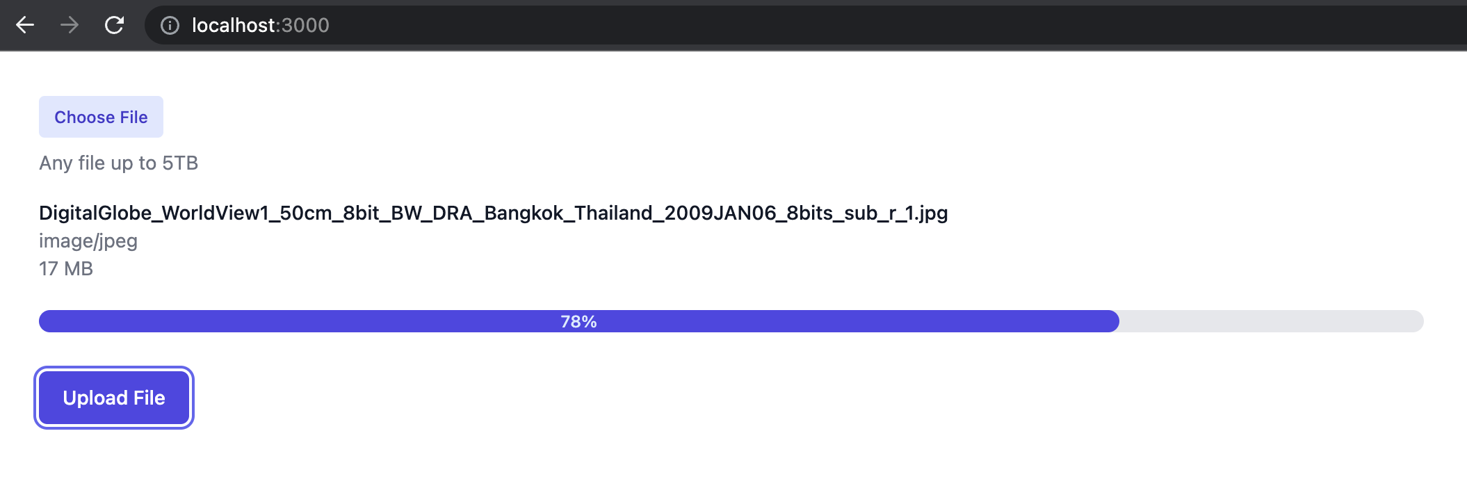
Adding these values and restarting our Next.js application should allow us to upload a file locally directly to s3. After restarting the local server, choose a file and click the Upload File button. You should see upload progress now:
Side note - If you followed along with the previous article and you're seeing funky progress updates, I noticed there was a bug in the Uploader class from the previous article that had one small typo where part.partNumber should be part.PartNumber. Change line 228 of lib/Uploader.ts to look like this:
const progressListener = this.handleProgress.bind(this, part.PartNumber - 1)
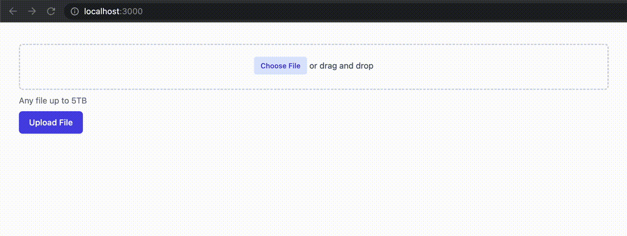
Adding drag and drop support
Adding drag and drop support is pretty simple. We don't need any external libraries but we will need to add some handlers in our component to handle the file drag, the file drop, showing when a file is being dragged over the drop area, and we will need to slightly refactor our onFileChanged to use a new function that we can also use for the drop file event. Here is what it will look like when we drag and drop a file onto the target:
Our Home component code looks like this now:
export default function Home() {
  const [inputValue, setInputValue] = useState("");
  const [upload, setUpload] = useState<Uploader | null>(null);
  const [progress, setProgress] = useState(0);
  const [draggingOver, setDraggingOver] = useState(false);

  const addFile = file => {
    const uploader = new Uploader({ file })
    .onProgress(({ percentage }) => {
      setProgress(percentage);
    })
    .onComplete((uploadResponse) => {
      console.log('upload complete', uploadResponse);
    })
    .onError((error) => {
      console.error('upload error', error)
    });

    setUpload(uploader);
  };

  const onFileChanged = e => {
    const file = [ ...e.target.files ][0];
    addFile(file);
  };

  const uploadClicked = () => {
    if (!upload) { return }

    upload.start();
  };

  const stopEvent = e => {
    e.preventDefault();
    e.stopPropagation();
  }

  const handleDragEnter = e => {
    stopEvent(e);
  };

  const handleDragLeave = e => {
    stopEvent(e);
    setDraggingOver(false);
  };

  const handleDragOver = e => {
    stopEvent(e);
    setDraggingOver(true);
  };

  const handleDrop = e => {
    stopEvent(e);
    setDraggingOver(false);
    const file = [ ...e.dataTransfer.files ][0];
    addFile(file);
  };

  return (
    <div className="mx-auto max-w-7xl sm:p-6 lg:p-8">
      <div className="flex text-sm text-gray-600">
        <div className="w-full">
          <div
            className={`${draggingOver
              ? "border-blue-500"
              : "border-gray-300"
            } mt-1 flex items-center justify-center px-6 pt-5 pb-6 border-2 border-dashed rounded-md`}
            onDrop={handleDrop}
            onDragOver={handleDragOver}
            onDragEnter={handleDragEnter}
            onDragLeave={handleDragLeave}
          >
            <label
              htmlFor="file-upload"
              className="inline-flex items-center rounded border border-transparent bg-indigo-100 px-2.5 py-1.5 text-xs font-medium text-indigo-700 hover:bg-indigo-200 focus:outline-none focus:ring-2 focus:ring-indigo-500 focus:ring-offset-2"
            >
              <div className="text-md">
                Choose File
              </div>
              <input
                id="file-upload"
                name="files"
                type="file"
                className="sr-only"
                onChange={onFileChanged}
                value={inputValue}
              />
            </label>
            <p className="pl-1 text-sm">or drag and drop</p>
          </div>
        </div>
      </div>

      <p className="py-2 text-sm text-gray-500">
        Any file up to 5TB
      </p>

      {upload && (
        <div className="py-2 flex flex-grow flex-col">
          <span className="text-sm font-medium text-gray-900">
            { upload.file.name }
          </span>
          <span className="text-sm text-gray-500">
            { upload.file.type }
          </span>
          <span className="text-sm text-gray-500">
            { prettyBytes(upload.file.size) }
          </span>

          <UploadProgressBar
            progress={progress}
          />
        </div>
      )}

      <button
        type="button"
        className="inline-flex items-center rounded-md border border-transparent bg-indigo-600 px-4 py-2 text-sm font-medium text-white shadow-sm hover:bg-indigo-700 focus:outline-none focus:ring-2 focus:ring-indigo-500 focus:ring-offset-2"
        onClick={uploadClicked}
      >
        Upload File
      </button>
    </div>
  )
}
Some things to note:
The
draggingOverstate keeps track of when the file is being dragged over the drop area.The
onFileChangedcalls a new functionaddFilewhich just takes a file as an input and sets the current upload to that file.The
handleDropfunction uses the newly addedaddFilefunction and passes in the event's file.The
handleDragEnter,handleDragLeave,handleDragOverhandle the styling of the drop area.I added a new wrapper div around the file upload form part that triggers the drag events.
And that's it. Super simple to add drag and drop support to our existing file upload form.
Converting our single file uploader to a multi file uploader
It would be nice to allow people to drag and drop or select multiple files when uploading to our application. So we're going to make a few changes to allow for that. Let's change our upload state to uploads, add multiple to the file input in our view, and change our functions and variables to reflect the multiple uploads. We have another issue, where our progress state is tied to one upload. There are many different ways to do this, like having a separate array/hash for each upload's progress, modifying the Uploader class to keep track of its own progress (sometimes you can't do this if you're using external libraries), or making sure each upload in our array has progress alongside it by encapsulating the uploads in the array in a wrapper object, like this:
interface FileUpload {
  uploader: Uploader;
  progress: number;
}

export default function Home() {
    const [uploads, setUploads] = useState<FileUpload[]>([]);
Let's choose the FileUpload path and modify all of our functions to handle multiple file uploads. So our Home component looks like this now:
interface FileUpload {
  uploader: Uploader;
  progress: number;
}

export default function Home() {
  const [inputValue, setInputValue] = useState("");
  const [uploads, setUploads] = useState<FileUpload[]>([]);
  const [draggingOver, setDraggingOver] = useState(false);

  const updateProgress = (filename, percentage) => {
    setUploads(state =>
      state.map(fileUpload =>
        fileUpload.uploader.file.name === filename
        ? { ...fileUpload, progress: percentage }
        : fileUpload
      )
    );
  };

  const addFiles = files => {
    setUploads(
      files.map(file => ({
        uploader: new Uploader({ file })
        .onProgress(({ percentage }) => {
          updateProgress(file.name, percentage);
        })
        .onComplete((uploadResponse) => {
          console.log('upload complete', uploadResponse);
        })
        .onError((error) => {
          console.error('upload error', error)
        }),
        progress: 0
      }))
    );
  };

  const onFilesChanged = e => {
    const files = [ ...e.target.files ];
    addFiles(files);
  };

  const uploadClicked = () => {
    if (!uploads.length) { return }

    uploads.forEach(upload => upload.uploader.start());
  };

  const stopEvent = e => {
    e.preventDefault();
    e.stopPropagation();
  }

  const handleDragEnter = e => {
    stopEvent(e);
  };

  const handleDragLeave = e => {
    stopEvent(e);
    setDraggingOver(false);
  };

  const handleDragOver = e => {
    stopEvent(e);
    setDraggingOver(true);
  };

  const handleDrop = e => {
    stopEvent(e);
    setDraggingOver(false);
    const files = [ ...e.dataTransfer.files ];
    addFiles(files);
  };

  return (
    <div className="mx-auto max-w-7xl sm:p-6 lg:p-8">
      <div className="flex text-sm text-gray-600">
        <div className="w-full">
          <div
            className={`${draggingOver
              ? "border-blue-500"
              : "border-gray-300"
            } mt-1 flex items-center justify-center px-6 pt-5 pb-6 border-2 border-dashed rounded-md`}
            onDrop={handleDrop}
            onDragOver={handleDragOver}
            onDragEnter={handleDragEnter}
            onDragLeave={handleDragLeave}
          >
            <label
              htmlFor="file-upload"
              className="inline-flex items-center rounded border border-transparent bg-indigo-100 px-2.5 py-1.5 text-xs font-medium text-indigo-700 hover:bg-indigo-200 focus:outline-none focus:ring-2 focus:ring-indigo-500 focus:ring-offset-2"
            >
              <div className="text-md">
                Choose File
              </div>
              <input
                id="file-upload"
                name="files"
                type="file"
                className="sr-only"
                onChange={onFilesChanged}
                multiple
                value={inputValue}
              />
            </label>
            <p className="pl-1 text-sm">or drag and drop</p>
          </div>
        </div>
      </div>

      <p className="py-2 text-sm text-gray-500">
        Any file up to 5TB
      </p>

      {uploads.map(({ uploader: { file }, progress }) => (
        <div key={file.name} className="py-2 flex flex-grow flex-col">
          <span className="text-sm font-medium text-gray-900">
            { file.name }
          </span>
          <span className="text-sm text-gray-500">
            { file.type }
          </span>
          <span className="text-sm text-gray-500">
            { prettyBytes(file.size) }
          </span>

          <UploadProgressBar
            progress={progress}
          />
        </div>
      ))}

      <button
        type="button"
        className="inline-flex items-center rounded-md border border-transparent bg-indigo-600 px-4 py-2 text-sm font-medium text-white shadow-sm hover:bg-indigo-700 focus:outline-none focus:ring-2 focus:ring-indigo-500 focus:ring-offset-2"
        onClick={uploadClicked}
      >
        Upload File
      </button>
    </div>
  )
}
We had to make a few changes but nothing very complicated. Some things to note:
The state variable
uploadschanged to an array ofFileUploadobjects which we defined in our new TypeScript interface.We had to change the
handleDropand renamedonFileChangedtoonFilesChangedto reflect having multiple uploads.We added
multipleto the file input to allow multiple files.The
addFilesfunction iterates through the array of dropped or selected files and sets the uploads to an array ofFileUploadobjects.We added the
updateProgressfunction that the UploaderonProgresscallback uses to find an upload in the array by the file's name, then updating the progress for that specific one.The
uploadClickedchanged to iterate through each upload and begin the upload.The view changed slightly to iterate over each upload in the
uploadsarray and display the same output like when we had a single upload.
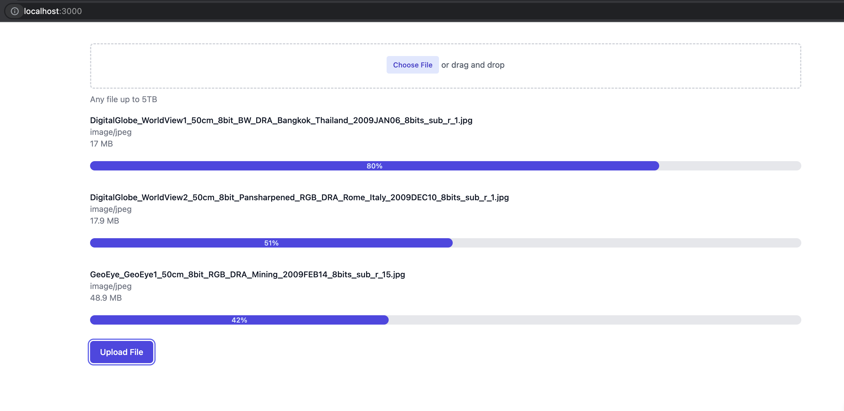
You should be able to drag and drop or select multiple files and see progress for each individual file now:
And that's it for now!
The full source code for this example is here: https://github.com/danoph/file-uploader-demo/tree/story/progress-and-multi-upload